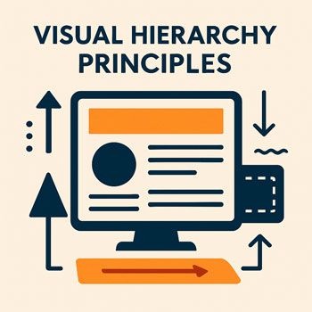
Visual Hierarchy Principles
How to guide user attention through size, contrast, spacing, and layout so your content is clear and easy to follow.
Estimated time: 20–30 minutes • Level: Beginner
What You’ll Learn
- What visual hierarchy is and why it matters for websites.
- How to guide the viewer’s eyes using size, color, alignment, and spacing.
- How to structure pages so users immediately understand what’s important.
- Practical hierarchy patterns for homepages, service pages, and blog posts.
- How to apply hierarchy in WordPress + Elementor with global styles.
What Is Visual Hierarchy?
Visual hierarchy is the intentional arrangement of elements so users see the most important information first. It shapes how people read, scan, and interact with your website.
Good hierarchy answers:
- Where should the eye go first?
- What’s most important on the page?
- How can we reduce confusion and increase clarity?
Core Visual Hierarchy Principles
-
Size & Scale
Bigger = more important. Use size differences to create clear levels of importance.
- H1 should be significantly larger than body text.
- CTAs should be larger than secondary buttons.
- Avoid too many text sizes—stick to a defined scale.
-
Color & Contrast
Use contrast to highlight key elements and guide attention.
- Use your primary color for CTAs and important links.
- High-contrast text improves scanability.
- Use muted colors for less-important info.
-
Spacing & Grouping (Proximity)
Elements that belong together should be grouped closely; unrelated items need more space.
- Keep spacing consistent inside sections.
- Add more space between major blocks.
- Group headings with their corresponding paragraphs.
-
Alignment & Structure
Aligning elements creates a clean, organized layout that feels easy to follow.
- Use left alignment for paragraphs and features.
- Keep content inside the same max-width container.
- Align icons, buttons, and headings consistently.
-
Typography Weight & Style
Bold, medium, and regular weights create layers of emphasis.
- H1, H2: bold; H3, H4: semi-bold.
- Body text: regular weight for readability.
- Use bold sparingly inside paragraphs to highlight key info.
-
Imagery & Visual Cues
Images can guide the user’s eyes toward key content.
- Use images that point inward toward text, not away.
- Ensure images aren’t overpowering in size or color.
- Use icons to support—not distract from—headlines.
Common Hierarchy Patterns
Pattern 1: Hero Section
- Large headline
- Short supporting text
- Primary CTA
- Relevant image (secondary)
Pattern 2: Service Section
- H2 heading
- Short description
- 3 or 4 equal-sized feature cards
- Consistent icons + CTA links
Pattern 3: Blog Post
- H1 title
- Muted meta text (author/date)
- Large featured image
- Clear H2 headings throughout
Implementing Visual Hierarchy in Elementor
- Set Global Typography: Apply a hierarchy scale to H1–H6 and body text.
- Use Consistent Spacing: Set 40–60px for section gaps and 24–40px for inner padding.
- Use Flex Containers: Align items consistently using start/center settings.
- Apply Global Colors: Use primary for CTAs, neutral for body text, muted for secondary info.
- Use Layout Width Rules: Set a max-width (1100–1200px) to keep lines readable.
- Adjust Mobile Hierarchy: Reduce font sizes but keep the importance order intact.
Do’s & Don’ts
Do
- Create clear size differences between headings.
- Use whitespace to separate ideas.
- Highlight CTAs with color + placement.
- Align text and icons consistently.
- Keep paragraphs short for readability.
Don’t
- Mix too many fonts or sizes.
- Make everything bold—it removes hierarchy.
- Use low-contrast text for important info.
- Place CTAs in visually weak positions.
- Create crowded sections without spacing.
Hands-On: Improve Hierarchy (10–15 Minutes)
- Take one existing webpage and increase the H1 size by 20%.
- Pick one CTA button and make it use your primary brand color.
- Group related paragraphs and add extra spacing between topics.
- Test your page on mobile—does the headline still stand out first?
- Reduce clutter by removing low-value visual elements.
Quick Visual Hierarchy Checklist
- Clear focal point at the top of each page.
- H1, H2, and body text sizes clearly differentiated.
- Primary CTAs stand out instantly.
- Spacing groups related content clearly.
- Left alignment for long text blocks.
- Consistent color and weight usage.