Course Content
01 – Website Setup & WordPress Basics
This module teaches the foundational steps required to build a fully functional WordPress website from scratch. You will learn how to choose and register a domain name, set up reliable hosting, configure SSL, create email accounts, and install WordPress using both 1-click and manual methods. The lessons guide you through the WordPress dashboard, essential settings, and the key differences between posts and pages. You’ll also learn how to install and configure critical plugins for SEO, security, and backups, as well as how to select and activate the right theme for your website’s goals. By the end of this module, you will understand how to create pages, build navigation menus, and implement basic security practices to keep your site safe. This section provides the technical foundation needed to confidently build and manage your WordPress website.
0/12
02 – Elementor Page Building
This module shows you how to design professional, visually engaging website pages using Elementor’s drag-and-drop page builder. You will learn how to install Elementor, navigate the editor, and use sections, columns, and widgets to create clean, modern layouts. The lessons cover global colors and typography, designing hero sections, using containers with Flexbox, and building fully responsive pages for desktop, tablet, and mobile. You’ll also learn how to add images, videos, icons, galleries, buttons, forms, and calls-to-action that drive user engagement. This module teaches you how to build site-wide elements such as headers, footers, and reusable templates using Elementor’s Theme Builder. By the end, you’ll be able to design polished, conversion-focused website pages—without writing any code.
0/12
03 – Business Website Essentials
This module teaches you how to structure, plan, and create the essential pages every high-performing business website needs. You’ll learn how to clearly communicate what your business does, who you help, and why visitors should choose you. The lessons walk you through building an effective Home page, writing a compelling About page, creating a Services page that converts, and designing a Contact page with professional forms. You’ll also learn how to add trust-building elements such as testimonials, logos, and badges, as well as how to set up strategic calls-to-action throughout your site. This module covers blog creation, content planning, and the structure of your first posts, along with important legal pages your site must include. By the end, you’ll know how to create a complete, conversion-optimized business website that supports your goals and builds credibility with your audience.
0/12
04 – Branding & Visual Design
This module teaches you how to create a cohesive, professional visual identity for your website and brand. You’ll learn the fundamentals of branding, including how to choose color palettes, pair fonts, and create a consistent look across every page. The lessons cover layout balance, white space, and visual hierarchy so your designs are clean, modern, and easy to navigate. You’ll also learn how to create a simple logo using DIY tools like Canva, select brand-appropriate images, and use icons and graphics effectively. This module shows you how to build a complete brand style guide and avoid common design mistakes, while ensuring your website remains accessible for all users. By the end, you’ll be able to design a cohesive, visually appealing website that strengthens your brand identity and improves user experience.
0/12
05 – SEO & Website Traffic
This module teaches you how to optimize your website for Google search and attract consistent, high-quality traffic. You’ll learn what SEO is, why it matters, and how to choose the right keywords for your business. The lessons cover on-page SEO essentials such as titles, meta descriptions, alt text, internal linking, and proper blog structure. You’ll also learn how to create local SEO pages, optimize images for speed, and set up Google Analytics and Google Search Console to track your performance. This module shows you how to create content that ranks and attracts customers, as well as how to drive additional traffic through social media. By the end, you’ll understand how to build a search-friendly, high-visibility website that brings in more visitors and potential customers over time.
0/12
06 – Website Launch & Maintenance
This module teaches you how to successfully launch, manage, and maintain your WordPress website for long-term performance. You’ll learn how to follow a complete pre-launch checklist, test your site across devices, and ensure all links, forms, and layouts work correctly. The lessons cover essential speed optimization techniques such as caching and minification, along with key security practices including firewalls, malware scans, and automatic backups. You’ll also learn how to connect your domain using DNS, monitor site propagation, and use analytics tools to track traffic and performance. This module shows you how to safely update WordPress, themes, and plugins, troubleshoot common errors, maintain mobile responsiveness, and follow a monthly website maintenance routine. By the end, you’ll know how to keep your site fast, secure, and running smoothly long after launch.
0/12
How to Make a Website

Using Sections, Columns, and Widgets

Module: Website Setup & WordPress Basics • Lesson: Using Sections, Columns, and Widgets

This lesson explains Elementor’s core building structure: Sections, Columns, and Widgets. Understanding this hierarchy is essential for building clean, responsive, and visually organized layouts.

Elementor Layout Overview

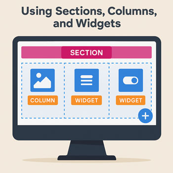
Every Elementor page is built on a three-part hierarchy:

  1. Sections – the largest container, spanning full width.
  2. Columns – vertical dividers within a section.
  3. Widgets – the actual content elements placed inside columns.

Each level has its own settings for layout, design, and responsive behavior.

Understanding Sections

A section is the foundation of your layout. It forms a horizontal block that can contain one or more columns.

What You Can Control in a Section

  • Content width (boxed or full width)
  • Background color or image
  • Padding and margin
  • Section height (fit to screen, min height, default)
  • Motion effects
  • Responsive visibility

When to Use a New Section

  • New design blocks (hero sections, features, testimonials)
  • Different background color or image
  • When spacing rules need to change
  • When content needs clean separation

Understanding Columns

Columns create vertical structure inside your sections. They help arrange widgets side-by-side.

Column Settings

  • Width (percentage-based)
  • Vertical alignment
  • Responsive stacking options
  • Backgrounds (Pro)
  • Padding and margin

Common Uses

  • Two-column layouts (text + image)
  • Three-column features
  • Sidebars or callout areas
  • Layouts that need symmetry or balance

Understanding Widgets

Widgets are the content elements you place inside columns. They include text, images, buttons, videos, icons, and more.

Common Widgets

  • Heading
  • Text Editor
  • Image
  • Button
  • Spacer
  • Icon
  • Divider

Widget Settings

  • Content – main text, image, or settings
  • Style – colors, fonts, backgrounds
  • Advanced – spacing, motion effects, custom positioning

How to Add Sections, Columns & Widgets

Adding a Section

  1. Click the + icon in the canvas.
  2. Select your preferred column structure.

Adding Columns

  • Right-click a section → Add New Column.
  • Drag a column’s width using the column handle.

Adding Widgets

  1. Open the left panel.
  2. Drag any widget onto a column.
  3. Edit the widget directly in the canvas.

Styling Sections, Columns & Widgets

Section Styling Examples

  • Large background image for hero sections
  • Full-width color backgrounds
  • Top/bottom padding for spacious layouts

Column Styling Examples

  • Extra padding around text blocks
  • Vertical alignment for centered content

Widget Styling Examples

  • Heading font sizes
  • Button colors and hover effects
  • Image shadows or border radius

Responsive Structure Tips

Your structure should adapt cleanly to tablets and mobile devices. Elementor helps you adjust layouts per device.

Key Tips

  • Columns stack vertically on mobile by default.
  • Use device-specific padding for compact mobile layouts.
  • Use “Reverse Columns” for better mobile flow.
  • Avoid too many nested columns—they break mobile layouts easily.

Activity: Build a Three-Section Layout

Open a blank page in Elementor and complete the following tasks:

  1. Create a hero section with:
    • Full-width background color or image
    • A heading widget
    • A button widget
  2. Create a two-column section with:
    • Text in the left column
    • An image in the right column
  3. Create a three-column features section with:
    • Icon widget
    • Heading widget
    • Text widget
  4. Adjust padding for each section.
  5. Check the layout on mobile and tablet views.

Assignment: Upload a screenshot of your completed three-section layout.

Best Practices for Sections, Columns & Widgets

  • Use Sections to group major content areas.
  • Use Columns for logical, side-by-side elements.
  • Use Widgets for all visible content elements.
  • Keep spacing consistent across sections.
  • Limit column nesting—it slows down the site.
  • Always preview mobile layouts before publishing.
  • Name items in the Navigator to stay organized.

Next Lesson: Designing with Elementor