Purpose of the Lesson
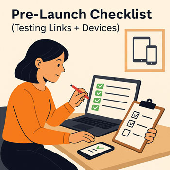
Before launching a website, a complete pre-launch review ensures the site works correctly across all devices, browsers, and user interactions. This step prevents usability issues, improves professionalism, and avoids technical errors that could impact user trust or conversions.
What Learners Should Understand
- How to test a website on multiple devices and screen sizes
- How to identify and repair broken links
- How to verify that navigation, forms, and interactive elements function correctly
- How to apply a professional final check before launching
1. Device Testing
Website responsiveness is expected in modern web design. Learners should test the site using:
Devices
- Desktop / laptop
- Tablet
- Mobile phone
What to Check
- Layout responsiveness: columns, spacing, alignment
- Mobile menu behavior
- Text readability (font size, line height)
- Buttons and tap-targets for mobile users
- Image scaling and cropping
- Interactive elements such as sliders or forms
Tools
- Browser DevTools → Responsive Design Mode
- Physical devices when available
2. Browser Compatibility Testing
Different browsers render code slightly differently. Check the site on:
- Google Chrome
- Mozilla Firefox
- Apple Safari
- Microsoft Edge
What to Evaluate
- Font rendering differences
- Animation smoothness
- Form functionality
- JavaScript or widget compatibility
- Unexpected layout shifts
3. Broken Link Checking
Broken links damage SEO and user experience.
What to Check
- Internal page links
- Menu links
- Footer links
- Button links
- Blog article links
- Social media icons
- External references
Tools
- Brokenlinkcheck.com
- Screaming Frog (free mode works for small sites)
- Chrome extensions such as “Check My Links”
4. Usability & Interaction Check
Ensure the website is friendly and intuitive.
Check All
- Navigation menus
- Dropdowns
- Contact forms
- Call-to-action buttons
- Scroll-to-top buttons
- Pop-ups or notifications
Questions to Consider
- Is the navigation clear?
- Are CTAs easy to spot?
- Is it obvious what the user should do next?
5. Content Accuracy Check
Final proofreading prevents mistakes from going live.
Verify
- Spelling and grammar
- Consistent heading structure (H1, H2, H3)
- Correct company details
- Updated contact information
- High-quality, optimized images
- Correct alt text for accessibility
6. Performance & Media Check
Fast websites create better user experiences and rank higher.
Check For
- Large uncompressed images
- Video playback issues
- Slow-loading widgets
- Layout shifts caused by unoptimized media
Activity: Perform a Full Site Check
Learners complete a full evaluation of their project website using the checklist above.
Requirements
- Test the site on three device types (desktop, tablet, mobile).
- Test in two or more browsers.
- Run a broken link scan and fix any issues.
- Review all page content for accuracy.
- Submit a site-check report with notes on issues found and improvements made.