Overview of the Elementor Editor
Module: Website Setup & WordPress Basics • Lesson: Overview of the Elementor Editor
This lesson introduces the Elementor visual editor interface. You will learn how the editor is structured, how to add and customize elements, and how to manage responsive settings and page layout controls.
What Is the Elementor Editor?
The Elementor Editor is a real-time, drag-and-drop design interface that allows you to visually build pages. Every change you make appears instantly on the screen, allowing precise layout control without coding.
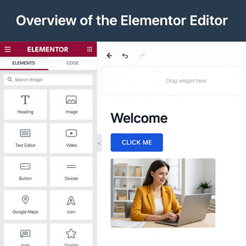
Elementor Interface Overview
When you click Edit with Elementor on any page, you’ll see three primary areas:
1. The Left Panel
- Contains widgets
- Styling options
- Advanced layout controls
2. The Canvas (Main Preview Area)
- Where you visually build the page
- Drag widgets here and edit inline
3. Bottom Toolbar
- Responsive mode
- Revision history
- Page settings
- Publish/update button
Using Widgets
Widgets are Elementor’s building blocks. You drag them from the left panel into your page layout.
Common Free Widgets
- Heading
- Text Editor
- Image
- Button
- Divider
- Video
- Icon
- Columns
Pro Widgets (Optional)
- Forms
- Slides
- Gallery (advanced)
- Price Table
- Testimonials
- Theme Builder widgets (header, post title, footer, archive)
Understanding Sections, Columns & Widgets
Elementor layouts follow a clear hierarchy:
1. Sections
- Main containers that span the full width
- Control background colors, images, and spacing
2. Columns
- Divide sections into vertical areas
- Adjust column widths and alignment
3. Widgets
- Content elements placed inside columns
- Text, images, buttons, icons, etc.
Understanding this structure helps you build clean and responsive page layouts.
The Left Editing Panel
The left panel contains three primary tabs whenever a widget, column, or section is selected:
1. Content Tab
- Edit text, images, and basic widget settings
2. Style Tab
- Typography
- Colors
- Borders
- Shadows
- Spacing
3. Advanced Tab
- Margin & padding
- Motion effects
- Custom positioning
- Custom CSS (Pro)
- Responsive visibility
Responsive Editing Tools
Elementor provides built-in tools to adjust your design for mobile, tablet, and desktop.
Responsive Features Include:
- Device-specific font sizes
- Custom spacing per device
- Hide/show elements on mobile/tablet/desktop
- Live preview for each device type
Revisions & Version History
If you make mistakes, Elementor makes it easy to revert changes.
Tools Available
- Actions: Undo/redo recent steps
- Revisions: Restore earlier published versions
- Autosave: Automatic drafts while editing
Activity: Explore the Elementor Editor
Edit a blank page with Elementor and complete the following tasks:
- Insert a Section with two columns.
- Place a Heading widget in the left column.
- Place an Image widget in the right column.
- Adjust the padding of the section.
- Use Responsive Mode to check mobile and tablet views.
- Open the Navigator and rename your widgets.
Assignment: Upload a screenshot of your Elementor editor with the Navigator open.
Elementor Editing Best Practices
- Use consistent spacing for a clean layout.
- Use global colors and fonts for branding consistency.
- Keep layouts simple—avoid unnecessary nested columns.
- Preview on mobile before publishing.
- Use the Navigator to stay organized.
- Save frequently to avoid losing work.