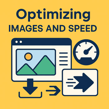
Optimizing Images and Speed
Make your WordPress site fast by choosing the right image formats, sizes, and delivery method—without sacrificing quality.
What You’ll Learn
- Which image formats to use (JPG/PNG/WebP/AVIF) and when.
- How to size, compress, and lazy-load images for speed.
- How to serve responsive images (srcset/sizes) and avoid layout shift.
- How to configure WordPress/Elementor, caching, and a CDN for faster delivery.
- How to check Core Web Vitals and iterate safely.
Core Principles for a Fast Site
-
Pick the Right Format
- Photographs: WebP (best balance) or AVIF (smaller but newer). Fallback JPG if needed.
- Logos/Icons with transparency: SVG if available (infinitely scalable), otherwise PNG.
- Illustrations/flat color: SVG or WebP.
- Animated: MP4/WebM for clips; avoid heavy GIFs.
-
Resize Before Upload
Do not upload 4000px images for a 1200px layout. Export close to the largest display size (e.g., 1600–1920px wide for full-width hero; 800–1200px for content images).
-
Compress Smartly
Target ~60–80% quality for JPG/WebP; visually compare to keep details. Use lossless for logos/UI.
-
Use Responsive Images
Provide multiple sizes so browsers download only what they need (
srcsetandsizes). -
Lazy-Load Below the Fold
Defer offscreen images with
loading="lazy"and reserve space to avoid layout shift. -
Deliver via CDN + Caching
A CDN brings images closer to users; caching avoids regenerating pages and thumbnails on every visit.
WordPress + Elementor: Recommended Setup
-
Set Image Sizes
- In Settings → Media, set reasonable max sizes (e.g., Large: 1600×1600; Medium-Large: 1200 width).
- After changes, Regenerate Thumbnails with a utility plugin to rebuild sizes.
-
Enable Next-Gen Formats
- Use an optimization plugin that converts uploads to WebP (and optionally AVIF) with automatic fallbacks.
- Serve from CDN (plugin integration or host-provided CDN).
-
Lazy-Load & Placeholder Blur
- Ensure lazy-load is on site-wide; exclude above-the-fold hero image to avoid late paint.
- Use low-quality placeholders (LQIP) or dominant-color backgrounds to reduce perceived load time.
-
Elementor Best Practices
- Prefer the Image widget (not Background images) for content; background images don’t auto-generate
srcsetand can be oversized. - Use Global Image Sizes and keep a consistent aspect ratio for cards/grids.
- Disable unused widgets/features to reduce CSS/JS payload when possible.
- Prefer the Image widget (not Background images) for content; background images don’t auto-generate
-
Caching & Minification
- Enable Page Cache, Browser Cache, and Object Cache (via host or plugin).
- Minify and combine CSS/JS cautiously; test Elementor editor and front-end after enabling.
- Use Critical CSS generation and defer non-critical JS to improve Largest Contentful Paint (LCP).
Practical Markup Examples
Responsive Image Example
<img
  src="/uploads/hero-1200.webp"
  srcset="/uploads/hero-600.webp 600w, /uploads/hero-900.webp 900w, /uploads/hero-1200.webp 1200w, /uploads/hero-1600.webp 1600w"
  sizes="(max-width: 768px) 100vw, (max-width: 1200px) 90vw, 1200px"
  width="1200" height="800"
  alt="Happy customer using our service"
  loading="eager" decoding="async" />
Reserve width/height to prevent layout shift (CLS). Use eager for the main above-the-fold hero only.
Lazy-Loaded Content Image
<img
  src="/uploads/gallery-800.webp"
  srcset="/uploads/gallery-400.webp 400w, /uploads/gallery-600.webp 600w, /uploads/gallery-800.webp 800w"
  sizes="(max-width: 768px) 100vw, 800px"
  width="800" height="534"
  alt="Before and after project gallery"
  loading="lazy" decoding="async" />
Measure & Improve Core Web Vitals
- LCP (Largest Contentful Paint): Optimize the hero image size/format, serve via CDN, inline critical CSS.
- CLS (Cumulative Layout Shift): Always set
width/heightor aspect-ratio boxes; avoid late-loading fonts causing jumps. - INP (Interaction to Next Paint): Defer non-critical JS, limit heavy third-party scripts, and reduce DOM complexity.
Quick Wins You Can Do Today
- Convert top 10 largest images to WebP and resize to actual display width.
- Enable lazy-loading and exclude the first viewport hero.
- Turn on page caching and browser caching.
- Serve images via a CDN; set a long
Cache-Controlmax-age for static assets. - Replace background images-in-sections with Image widgets where possible for automatic
srcset.
Troubleshooting & Safety Checks
-
Blurry Images?
Upload at least 1.5× the displayed size for high-DPI screens and ensure compression isn’t too aggressive.
-
Images Still Heavy?
Re-export to WebP/AVIF, crop tighter, or simplify backgrounds. Avoid 100% quality settings.
-
Layout Jumps?
Add explicit dimensions or use CSS
aspect-ratio. Avoid inserting images above content after load. -
Plugin Conflicts?
Disable one optimization at a time (lazy-load, combine JS, defer) to identify the culprit; clear caches after each change.
Optimization Checklist
- WebP/AVIF enabled with JPG/PNG fallback where needed.
- Images resized to realistic max width before upload.
srcset/sizesgenerated (prefer Image widgets over backgrounds).loading="lazy"on below-the-fold images.- Page, browser, and object caching configured; CDN active.
- Critical CSS generated; non-critical JS deferred.
- Core Web Vitals checked after each change.