Course Content
01 – Website Setup & WordPress Basics
This module teaches the foundational steps required to build a fully functional WordPress website from scratch. You will learn how to choose and register a domain name, set up reliable hosting, configure SSL, create email accounts, and install WordPress using both 1-click and manual methods. The lessons guide you through the WordPress dashboard, essential settings, and the key differences between posts and pages. You’ll also learn how to install and configure critical plugins for SEO, security, and backups, as well as how to select and activate the right theme for your website’s goals. By the end of this module, you will understand how to create pages, build navigation menus, and implement basic security practices to keep your site safe. This section provides the technical foundation needed to confidently build and manage your WordPress website.
0/12
02 – Elementor Page Building
This module shows you how to design professional, visually engaging website pages using Elementor’s drag-and-drop page builder. You will learn how to install Elementor, navigate the editor, and use sections, columns, and widgets to create clean, modern layouts. The lessons cover global colors and typography, designing hero sections, using containers with Flexbox, and building fully responsive pages for desktop, tablet, and mobile. You’ll also learn how to add images, videos, icons, galleries, buttons, forms, and calls-to-action that drive user engagement. This module teaches you how to build site-wide elements such as headers, footers, and reusable templates using Elementor’s Theme Builder. By the end, you’ll be able to design polished, conversion-focused website pages—without writing any code.
0/12
03 – Business Website Essentials
This module teaches you how to structure, plan, and create the essential pages every high-performing business website needs. You’ll learn how to clearly communicate what your business does, who you help, and why visitors should choose you. The lessons walk you through building an effective Home page, writing a compelling About page, creating a Services page that converts, and designing a Contact page with professional forms. You’ll also learn how to add trust-building elements such as testimonials, logos, and badges, as well as how to set up strategic calls-to-action throughout your site. This module covers blog creation, content planning, and the structure of your first posts, along with important legal pages your site must include. By the end, you’ll know how to create a complete, conversion-optimized business website that supports your goals and builds credibility with your audience.
0/12
04 – Branding & Visual Design
This module teaches you how to create a cohesive, professional visual identity for your website and brand. You’ll learn the fundamentals of branding, including how to choose color palettes, pair fonts, and create a consistent look across every page. The lessons cover layout balance, white space, and visual hierarchy so your designs are clean, modern, and easy to navigate. You’ll also learn how to create a simple logo using DIY tools like Canva, select brand-appropriate images, and use icons and graphics effectively. This module shows you how to build a complete brand style guide and avoid common design mistakes, while ensuring your website remains accessible for all users. By the end, you’ll be able to design a cohesive, visually appealing website that strengthens your brand identity and improves user experience.
0/12
05 – SEO & Website Traffic
This module teaches you how to optimize your website for Google search and attract consistent, high-quality traffic. You’ll learn what SEO is, why it matters, and how to choose the right keywords for your business. The lessons cover on-page SEO essentials such as titles, meta descriptions, alt text, internal linking, and proper blog structure. You’ll also learn how to create local SEO pages, optimize images for speed, and set up Google Analytics and Google Search Console to track your performance. This module shows you how to create content that ranks and attracts customers, as well as how to drive additional traffic through social media. By the end, you’ll understand how to build a search-friendly, high-visibility website that brings in more visitors and potential customers over time.
0/12
06 – Website Launch & Maintenance
This module teaches you how to successfully launch, manage, and maintain your WordPress website for long-term performance. You’ll learn how to follow a complete pre-launch checklist, test your site across devices, and ensure all links, forms, and layouts work correctly. The lessons cover essential speed optimization techniques such as caching and minification, along with key security practices including firewalls, malware scans, and automatic backups. You’ll also learn how to connect your domain using DNS, monitor site propagation, and use analytics tools to track traffic and performance. This module shows you how to safely update WordPress, themes, and plugins, troubleshoot common errors, maintain mobile responsiveness, and follow a monthly website maintenance routine. By the end, you’ll know how to keep your site fast, secure, and running smoothly long after launch.
0/12
How to Make a Website

How to Use Containers (If Elementor Flexbox is On)

Module: Website Setup & WordPress Basics • Lesson: How to Use Containers (Flexbox Layout)

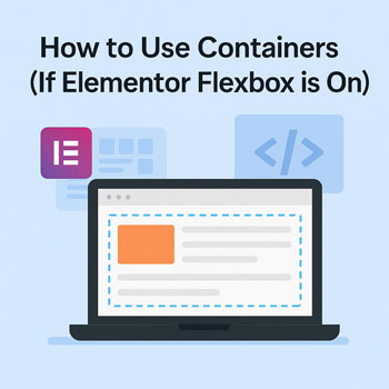
This lesson explains how to build layouts using Elementor’s Container system powered by Flexbox. If your site has the Flexbox Container feature enabled, Containers replace Sections and Columns, giving you more control and improved performance.

What Are Containers?

Containers are Elementor’s modern layout system based on CSS Flexbox. Containers replace Sections and Columns, allowing a more streamlined and powerful approach to page design.

Key Features

  • More flexible layouts
  • Fewer nested structures (better performance)
  • Full Flexbox alignment controls
  • Better responsive design capabilities

Why Use Flexbox Containers?

Flexbox containers offer several advantages over the traditional Section + Column system:

  • Faster page load due to reduced HTML structure
  • More layout freedom (horizontal or vertical stacking)
  • Precise alignment control for complex layouts
  • Cleaner responsive behavior

Container Structure Overview

Containers allow flexible, nested layouts. Your pages will consist of:

  1. Parent Container — top-level wrapper
  2. Inner Containers — used for layout grouping
  3. Widgets — content added inside containers

Instead of sections and columns, layout direction and alignment are handled by Flexbox settings.

How to Add Containers

Add a Parent Container

  1. Click the + icon in the Elementor canvas.
  2. Select a Container.
  3. Choose a pre-set structure or start with a blank container.

Add Child Containers

  • Right-click inside a container → Add New Container.
  • Or drag a Container widget from the left panel.

Add Widgets

Drag widgets inside any container to add text, images, buttons, etc.

Flex Direction Explained

The Direction setting controls whether items stack horizontally or vertically.

Flex Direction Options

  • Row – items side-by-side horizontally
  • Column – items stacked vertically
  • Row Reverse – reversed horizontal layout
  • Column Reverse – reversed vertical layout

Example: A hero with text on the left and image on the right uses Row.

Alignment & Justification

Justify Content

Controls spacing along the main axis:

  • Start
  • Center
  • Space Between
  • Space Around
  • End

Align Items

Controls alignment across the main axis:

  • Start
  • Center
  • Stretch
  • End

Gap

Add spacing between items without using margins.

Nesting Containers

You can nest containers to create flexible layouts such as multi-column feature blocks or split hero sections.

Examples

  • Parent container (row) → 2 inner containers (columns-style layout)
  • Parent container (column) → stacked content sections
  • Grid-created container groups for advanced layouts

Styling Containers

Containers have advanced styling options similar to sections.

Common Styling Controls

  • Background color or gradient
  • Background image with overlay
  • Padding and margin
  • Border and border radius
  • Box shadows
  • Custom width (px, %, vw)
  • Horizontal or vertical gap spacing

Responsive Controls for Flexbox Containers

Flexbox makes responsive layout adjustments easier.

Key Responsive Tools

  • Switch direction on mobile (Row → Column)
  • Reverse order (Column Reverse)
  • Device-specific gap settings
  • Device-specific margin/padding
  • Hide/show containers per device

Activity: Build a Hero Layout Using Containers

Create a simple hero section using Flexbox Containers with the following requirements:

  1. Create a parent container with Row direction.
  2. Add two inner containers:
    • Left: text and a button
    • Right: an image
  3. Set the parent container’s height to a minimum of 600px.
  4. Add a background color or image to the parent container.
  5. Use Align Items: Center to vertically center the content.
  6. Switch to mobile view and set direction to Column.

Assignment: Upload a screenshot of your container-based hero layout.

Best Practices for Container Layouts

  • Use fewer containers for cleaner markup and faster load times.
  • Use Gap for spacing instead of random margins.
  • Use responsive direction changes to optimize layouts on mobile.
  • Stick to consistent padding values across containers.
  • Name your containers in the Navigator for easier editing.
  • Use global colors and typography for consistent branding.

Next Lesson: Designing Feature Sections with Elementor