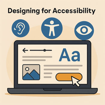
Designing for Accessibility
How to create a website that can be used and understood by everyone—including people with disabilities—through accessible design principles.
What You’ll Learn
- What accessibility is and why it matters for businesses.
- Key design principles that help all users—including screen-reader and keyboard users.
- How to improve text contrast, layout, navigation, and interactions.
- How to add alt text, semantic headings, and accessible components.
- How to implement accessibility inside WordPress + Elementor.
What Is Accessible Design?
Accessible design ensures your website is usable by people with different needs, including visual, auditory, motor, and cognitive disabilities. Accessibility is not just a legal requirement; it improves usability for everyone—especially mobile users, seniors, and users with slow internet speeds.
Core Accessibility Principles
-
Provide Sufficient Color Contrast
Text should be easy to read on any background.
- Aim for a contrast ratio of at least 4.5:1 for body text.
- Use dark text on light backgrounds (or vice versa).
- Add overlays when placing text on images.
-
Use Accessible Text Sizes
Small text strains the eyes and reduces readability.
- Body text: 16–18px.
- Line height: 1.5–1.7.
- Avoid long lines—keep content inside a max-width container.
-
Use Semantic Headings (H1–H6)
Screen readers use headings to navigate the page.
- Only one H1 per page.
- Use H2 for major sections, H3 for subsections.
- Never skip heading levels for styling.
-
Ensure Keyboard-Friendly Navigation
Users must be able to navigate your site without a mouse.
- All links and buttons should be focusable.
- Focus indicators should be visible (outline or highlight).
- Avoid interactive elements that require hover-only interaction.
-
Add Meaningful Alt Text to Images
Alt text allows screen readers to describe images to visually impaired users.
- Describe the purpose, not the pixels.
- Decorative images can have empty alt text (
alt=""). - Never stuff keywords into alt text.
-
Use Clear, Descriptive Link Text
Avoid vague links like “Click here.”
- Use action-oriented text: “Download the guide,” “Book a consultation.”
- Make link purpose obvious even without surrounding context.
-
Create Accessible Forms
Forms must be easy to understand and use with assistive technology.
- Each field must have a visible label.
- Use clear error messages and success messages.
- Make touch targets large enough on mobile.
-
Reduce Motion & Flashy Animations
Overuse of animation can cause dizziness, distraction, or motion sensitivity issues.
- Avoid parallax backgrounds or fast-moving elements.
- Use subtle fades instead of slides or spins.
- Keep animations optional whenever possible.
Implementing Accessibility in Elementor
- Enable Accessible Global Styles: Define high-contrast text and accessible link colors.
- Use the Navigator: Ensure headings follow a logical order (H1 → H2 → H3).
- Check Focus States: Buttons and links should have visible focus outlines.
- Use ALT Text Fields: Add descriptive alt text when uploading images to WordPress.
- Test Keyboard Navigation: Press Tab to ensure all interactive elements can be reached.
- Use the Accessibility Checker Plugin (Optional): Scan for missing labels, low contrast, etc.
Do’s & Don’ts
Do
- Use readable text sizes and high contrast.
- Group related elements with consistent spacing.
- Add descriptive alt text to important images.
- Make your site fully keyboard accessible.
- Ensure your navigation is simple and predictable.
Don’t
- Use text too small for comfortable reading.
- Place text over busy images without overlays.
- Rely on color alone to communicate meaning.
- Use animations that distract or cause motion discomfort.
- Make links vague or non-descriptive.
Quick Accessibility Exercises (10–15 Minutes)
- Increase your body text size to at least 16px.
- Add alt text to the first five images on your homepage.
- Test your site using only the keyboard (Tab, Enter, Shift+Tab).
- Update headings to follow a proper semantic order.
- Remove or soften any overly flashy animations.
Accessibility Checklist
- Readable text with strong contrast.
- Logical heading structure (H1 → H2 → H3).
- Keyboard-friendly navigation.
- Clear labels and accessible forms.
- Consistent spacing and alignment.
- Alternative text for all meaningful images.
- Minimal, non-distracting animations.
