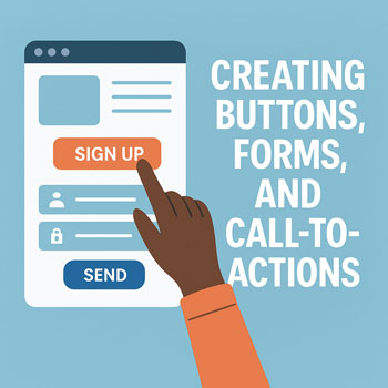
Creating Buttons, Forms, and Call-to-Actions
Goal: Design clear, accessible, and conversion-focused buttons and forms, then connect them to business outcomes (email signups, inquiries, bookings, purchases).
Learning Objectives
- Write compelling CTA copy and choose the right CTA type for the page intent.
- Design buttons with proper contrast, sizing, and accessible states.
- Build forms (contact, quote, newsletter) with validation, spam protection, and confirmations.
- Connect forms to email/CRM tools and track conversions.
Key Concepts
- CTA (Call-to-Action): A prompt that asks visitors to take the next step (e.g., “Get a Quote”).
- Primary vs Secondary CTA: One clear primary action per view; secondary links support but don’t compete.
- Friction: Every extra field or step can reduce conversions—keep it minimal.
- Hierarchy: Placement, size, and color signal importance.
Crafting Effective CTA Copy
- Action + Benefit: “Download the Guide” → “Get the Guide” is good; “Get the Guide to Cut Costs” is better.
- Specificity: “Start 14-Day Trial” beats “Learn More”.
- Risk Reversal: Add reassurance near the CTA: “No credit card required.”
Formula: [Verb] + [Outcome] + (Optional Reassurance) — e.g., “Book a Free Consult — No Obligation”
Button Design Best Practices
- Contrast: Button color should pass WCAG AA contrast against its background (aim for 4.5:1).
- Size & Touch Target: Minimum 44×44px clickable area; generous padding (e.g., 12–16px vertical).
- Shape: Consistent radius across the site; don’t mix many styles.
- States: Provide hover, active, and focus states; focus outlines must be visible.
- Label: Short, scannable text (1–3 words if possible).
- Icons: Optional; place on the right for “forward” actions (→) and on the left for supportive cues (✓).
Form UX & Structure
- Right Fields Only: Start with name, email, message. Add fields only if they materially improve lead quality.
- Logical Grouping: Group related fields; use clear labels, not placeholder-only text.
- Validation: Real-time, inline messages; tell users how to fix errors.
- Spam Protection: Honeypot, reCAPTCHA, or provider-side filtering.
- Privacy: Link to your privacy policy; add an explicit consent checkbox if required.
- Confirmation: Show a success message and/or redirect to a thank-you page.
Where to Place CTAs
- Hero Section: One primary CTA above the fold.
- End of Sections: After explaining a benefit, add a related CTA.
- Blog Posts: Mid-article text CTA or end-of-post banner to capture engaged readers.
- Navigation/Footer: Persistent “Contact” or “Get a Quote”.
Elementor: Creating a Button
- Open your page in Edit with Elementor.
- Drag the Button widget into the desired section.
- Set Text (e.g., “Get a Quote”).
- Set Link to a page, section ID (e.g.,
#contact), or external URL. - In Style, adjust typography, padding, and border radius.
- In Hover, define color change and transition (e.g., 0.2–0.3s).
- In Advanced → Responsive, hide/show secondary buttons on mobile if space is tight.
Elementor: Building a Form
- Install & activate a form solution:
- Elementor Form widget (Pro), or
- Form plugin (e.g., WPForms, Gravity Forms, Ninja Forms) and place it via shortcode.
- Fields: Add Name, Email, Message. Mark required fields clearly.
- Validation: Enable inline errors; customize messages.
- Spam: Enable Honeypot and/or reCAPTCHA v2/v3.
- Actions After Submit: Email, Redirect (thank-you page), Webhook, or integration (e.g., Mailchimp).
- Notifications: Send to an inbox monitored daily; set a descriptive subject line.
- Confirmations: Show success message and redirect to a thank-you page for analytics tracking.
Using a Shortcode Example: Add a Shortcode widget and paste something like:
[wpforms id="123" title="false" description="false"]Tracking & Measurement
- Thank-You Page: Use for conversion goals in your analytics platform.
- Event Tracking: Track button clicks (e.g., “cta_primary_click”) for A/B tests.
- Email Deliverability: Configure SMTP (via a plugin) to reduce lost notifications.
Compliance & Accessibility
- Accessibility: Provide clear labels, visible focus states, and descriptive link/button text.
- GDPR/CCPA: Use consent checkboxes where appropriate; link to privacy policy.
- Language: Avoid vague CTAs (“Click Here”); be descriptive (“Download Pricing PDF”).
Common Mistakes to Avoid
- Too many CTAs competing on the same screen.
- Low-contrast buttons that look like plain text links.
- Long forms with unnecessary fields.
- No confirmation, no thank-you page, and no tracking.
- Missing spam protection or SMTP, leading to lost leads.
Activity: Create a High-Converting CTA + Form
- Create one primary CTA button in your hero and link it to a contact section or page.
- Build a contact form (Name, Email, Message) with inline validation and reCAPTCHA.
- Send submission notifications to your email and redirect to a thank-you page.
- Add a secondary CTA at the end of your services section with different wording (e.g., “Request Pricing”).
Checklist
- One clear primary CTA per page view.
- Accessible colors, focus styles, and button states.
- Minimal form fields; inline validation active.
- Spam protection and SMTP configured.
- Thank-you page + analytics goal/event tracking.
Quick Reference: CTA Copy Ideas
- Get a Free Quote
- Book a Call
- Start Free Trial
- Download the Guide
- See Pricing
Knowledge Check (Mini-Quiz)
- What’s the main difference between a primary and secondary CTA?
- Name two ways to reduce form friction.
- Why is a thank-you page useful for analytics?
- List two accessibility requirements for buttons.
- What is the purpose of a honeypot field?
Practical Assignment
Create a hero section with a primary CTA, build a contact form with spam protection, route notifications to your inbox, and redirect to a thank-you page. Verify conversions by submitting a test entry and confirming the email + thank-you page load.