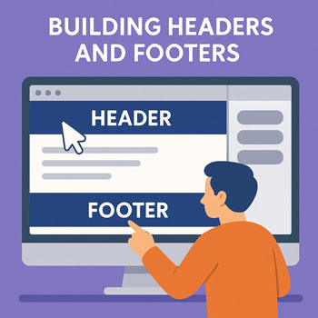
Building Headers and Footers
Learn how to design effective headers and footers using WordPress or Elementor. This lesson covers layout structure, navigation usability, branding placement, and essential elements every site should include.
Learning Objectives
- Understand the purpose and structure of headers and footers.
- Create a header with branding, navigation, and CTAs.
- Design a functional footer with contact info, menus, and legal links.
- Build responsive versions for desktop, tablet, and mobile.
- Use Elementor Theme Builder (or your theme settings) to manage global header and footer layouts.
The Role of Headers and Footers
Header Purpose
The header is the first navigation tool your user interacts with. It must be clear, concise, and consistent across your site.
- Establish brand identity (logo, colors, style).
- Provide immediate navigation access.
- Guide users with a primary Call-to-Action (CTA).
Footer Purpose
The footer provides supplemental navigation, trust-building information, and legal essentials.
- Secondary navigation and sitemap.
- Contact details, hours, address, or map.
- Social media links.
- Legal pages: Privacy Policy, Terms, Disclaimer.
- Branding, copyright, or accreditation badges.
Essential Header Elements
- Logo/Brand Name: Linked to the homepage.
- Primary Navigation Menu: Key pages only, typically 4–6 items.
- CTA Button: “Contact,” “Get a Quote,” “Book a Call,” etc.
- Mobile Menu: Hamburger icon + off-canvas navigation.
- Sticky Header (optional): Header remains visible while scrolling.
Best Practices
- Keep the header height minimal for readability.
- Avoid too many links—keep it simple.
- Use high-contrast colors for text and buttons.
- Ensure the mobile menu is intuitive and easy to open.
Building a Header in Elementor (Theme Builder)
- Go to Templates → Theme Builder.
- Select Header → Add New Header.
- Choose a template or start from scratch.
- Add a Container (or Section).
- Add three elements:
- Logo widget
- Nav Menu widget
- Button widget for CTA
- Align items using Flexbox: space-between for clean spacing.
- Set responsive visibility for mobile (e.g., hide desktop menu, show hamburger menu).
- Click Publish → Display Conditions → Entire Site.
Making Headers & Footers Responsive
Tablet & Desktop
- Logo on the left, menu in center/right, CTA on right.
- Ensure text sizes scale smoothly.
Mobile
- Use a hamburger menu to save space.
- Place the logo prominently at top-left.
- Hide the desktop navigation; show the mobile nav widget.
- Create a tap-friendly CTA inside the mobile menu.
Footer Responsiveness
- Collapse multi-column footers into stacked sections.
- Increase spacing between links for tap accessibility.
Common Mistakes to Avoid
- Overloaded menus with too many links.
- Logos that are too large (taking up excessive vertical space).
- Footer cluttered with unnecessary widgets.
- Missing legal links or outdated copyright year.
- Poor mobile navigation (text too small, menu hard to tap).
Activity: Build Your Site’s Header & Footer
- Create a global header using Theme Builder.
- Add a logo, navigation menu, and CTA button.
- Create a global footer with 3–4 columns.
- Ensure both header and footer are fully responsive.
- Publish them across the entire site.
Deliverable: Submit screenshots of your header and footer on Desktop and Mobile.
