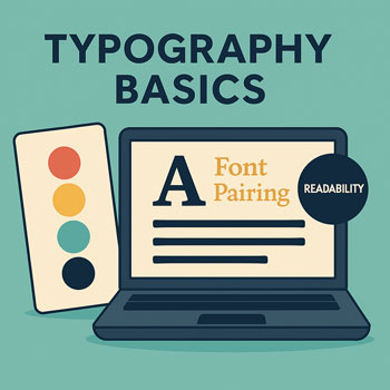
Typography Basics (Fonts, Pairing, Readability)
Learn how to choose fonts, pair typefaces, and structure text for clean, accessible, and professional website design.
What You’ll Learn
- How typography shapes brand perception.
- The difference between serif, sans-serif, and display fonts.
- How to pair fonts without conflict.
- How to set up a scalable type system (headings, body text, spacing).
- How to improve readability using hierarchy, rhythm, and contrast.
- How to set global typography in Elementor.
Why Typography Matters
Typography influences trust, clarity, and user experience. Before color, images, or layout, users read text first. Strong typography ensures your message lands clearly and professionally.
- First impressions: Fonts affect how modern, friendly, or authoritative your brand feels.
- Readability: Clean type reduces friction and keeps users engaged.
- Consistency: A defined type system makes your design look intentional.
Font Categories & When to Use Them
Sans-Serif
Clean, modern, simple. Great for body text and digital-first brands.
Examples: Inter, Lato, Montserrat, Roboto.
Serif
Traditional, professional, high-trust. Works well for headings or editorial content.
Examples: Playfair Display, Merriweather, Georgia.
Display / Decorative
Stylized and expressive. Use only for large headings or brand-specific design.
Examples: Abril Fatface, Lobster, custom scripts.
How to Pair Fonts (Simple Rules)
- Use one primary font for body text.
Choose a clean sans-serif for the majority of your website content.
- Pair contrast, not conflict.
A serif heading + sans-serif body is a safe classic combo. Two sans-serifs also work if weights differ.
- Limit your fonts.
Use 1–2 fonts maximum (one for body, one optional for headings).
- Avoid overly similar or overly decorative combinations.
Reliable Pairing Examples
- Playfair Display (H1–H2) + Inter (Body)
- Merriweather (H1–H2) + Lato (Body)
- Montserrat (Headings) + Lato (Body)
- Poppins (Headings) + Inter (Body)
Setting Up a Scalable Type System
Create consistent visual hierarchy using predictable sizes, weights, and spacing.
| Element | Recommended Size | Notes |
|---|---|---|
| H1 | 36–48px | Used for page titles. |
| H2 | 28–32px | Section titles. |
| H3 | 22–26px | Subsections. |
| Paragraph | 16–18px | Main body text; avoid going below 16px. |
| Line Height | 1.5–1.7 | Improves readability. |
Tip: For mobile, scale headings down ~10–20% using Elementor’s responsive controls.
Readability Principles
- Keep line length between 50 and 75 characters.
- Use adequate spacing: 24–32px between paragraphs; 40–60px between sections.
- Use contrast wisely: Deep text (#111, #222) on light backgrounds improves comfort.
- Use bold for emphasis, not ALL CAPS.
- Avoid center-aligned long text.
Examples of Headline & Body Combinations
Elegant & Editorial
Serif headings with clean sans body create a premium, editorial vibe.
Modern & Bold
Rounded, geometric headings paired with a softer body font feel contemporary.
Clean & Friendly
Light curves and high legibility create an approachable feel.
Setting Typography in Elementor
- Go to Site Settings → Typography.
- Set global font for Body Text (16–18px, line height 1.5–1.7).
- Set global fonts for H1–H6 using your paired heading font.
- Set consistent font weights (400 for body, 600–700 for headings).
- Update all templates: Header, Footer, Posts, Buttons.
- Test on mobile and adjust scale using Elementor’s responsive settings.
Hands-On: Typography Exercises
- Choose a body font: Inter, Lato, or Roboto.
- Choose a heading font: Optionally pair a serif or stronger sans-serif.
- Set your H1–H3 sizes: Use the table above as a guide.
- Copy 1 paragraph of your website’s content and test it with your chosen fonts.
- Check readability: View on desktop + mobile; adjust line height and spacing.
Common Mistakes to Avoid
- Using too many fonts (more than 2).
- Using fonts with poor readability for body content.
- Allowing headings to be too close to previous text.
- Using pure black (#000) instead of charcoal (#111–222).
- Setting body text below 16px.
Quick Typography Checklist
- 1–2 fonts selected.
- Global fonts set in Elementor.
- Body text 16–18px with proper line height.
- Consistent heading scale (H1 > H2 > H3).
- Readable line length (50–75 characters).
- Strong contrast for text.
FAQ: Common Beginner Questions
Should I upload custom fonts?
Only if required for branding. Web-safe fonts load faster and are easier to manage.
Is it okay to use Google Fonts?
Yes. They’re optimized for web usage and easy to integrate with WordPress and Elementor.
What if my theme already has fonts set?
Override fonts in Elementor Site Settings for complete control and consistency.
Next Steps
- Finalize your heading + body font pairing.
- Set global typography in Elementor.
- Audit 2 existing pages for spacing, readability, and consistency.
Continue to: Creating a Consistent Brand Look.