Designing Hero Sections
Module: Website Setup & WordPress Basics • Lesson: Designing Hero Sections
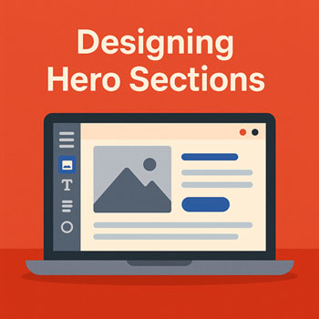
This lesson teaches you how to design effective hero sections using Elementor. A hero section is the first visual block of your webpage—usually containing a headline, supporting text, and a call-to-action button.
What Is a Hero Section?
A hero section is the topmost area of a webpage. It introduces your brand or message with strong visuals and clear calls to action.
Typical Hero Structure
- Large headline
- Short supporting subtitle
- Primary call-to-action button
- Optional image or illustration
- Background image, gradient, or color block
Why Hero Sections Matter
The hero section sets the tone for your entire website. It should grab attention and clearly communicate value.
Effective Hero Sections
- Increase engagement
- Improve user clarity and reduce bounce rates
- Help guide visitors toward important actions (e.g., contacting, purchasing)
- Strengthen brand identity
Hero Section Layout Structure
Most hero sections follow a simple layout built using Elementor’s Sections, Columns, and Widgets.
Common Layout Types
- Centered Layout: Headline, text, and button centered (great for simple landing pages).
- Two-Column Layout: Text on the left, image on the right.
- Full Background Layout: Large background image with text overlay.
Choosing Backgrounds
Your hero background sets the visual tone. Elementor allows several background types.
Background Options
- Solid Color: Clean and minimal.
- Gradient: Modern and subtle shading.
- Image: Popular for visual impact.
- Video: High impact, but heavier on performance.
Choosing the Right Background
- Ensure text is readable (use overlays if needed).
- Use high-quality, compressed images.
- Avoid distracting videos or animations.
- Use brand-aligned colors.
Key Content Elements
Every strong hero section contains core messaging elements.
Essential Widgets
- Heading: Your main message (H1).
- Text Editor: Supporting paragraph or tagline.
- Button: Call-to-action (CTA).
- Image or Icon: Optional visual support.
- Spacer: For controlling vertical spacing.
How to Build a Hero Section in Elementor
Step 1: Add a New Section
- Click + in the Elementor canvas.
- Select a single column or two-column layout.
Step 2: Set Section Layout
- Go to Edit Section → Layout.
- Set Content Width to Boxed or Full Width.
- Set Height to Min Height (e.g., 600–800px).
Step 3: Add Background
- Go to Style.
- Select Background Type → Color, Gradient, or Image.
- If using an image:
- Set background-size to Cover.
- Set background-position to Center Center.
- Add a background overlay if text needs more contrast.
Step 4: Insert Content
- Drag a Heading widget into the column.
- Add a Text Editor widget below it.
- Add a Button widget for the CTA.
- Adjust alignment and spacing as needed.
Step 5: Style the Text & Button
- Apply Global Colors and Global Typography.
- Adjust font size for desktop, tablet, and mobile.
- Change button color, border radius, and hover effects.
Step 6: Adjust Spacing
- Use padding inside the section for breathing room (e.g., 80–120px top/bottom).
- Add spacers to create clear content hierarchy.
Styling Your Hero Section
Tips for Styling
- Use bold, clear typography.
- Match colors to your brand palette.
- Choose high-contrast text colors for readability.
- Use a single, strong CTA button.
- Balance spacing for a clean layout.
Mobile & Tablet Optimization
Hero sections must look great on all devices. Elementor makes this easy with responsive controls.
Key Adjustments
- Decrease font sizes for mobile.
- Reduce padding to avoid excessive scrolling.
- Center-align text for narrow screens.
- Check button width and tap-friendly spacing.
- If using a two-column layout, stack columns vertically.
Activity: Build a Custom Hero Section
Design a hero section using Elementor with the following requirements:
- Full-width section with a background image or gradient.
- Headline (H1) and supporting text.
- Primary call-to-action button.
- Minimum height of 600–700px.
- Responsive adjustments for tablet and mobile.
- Use global colors and typography throughout.
Assignment: Upload a screenshot of your completed hero section in desktop and mobile view.
Best Practices for Hero Sections
- Stick to one core message—keep it simple and clear.
- Use strong CTAs (“Get Started,” “Contact Us,” “Learn More”).
- Avoid text over busy parts of an image.
- Use overlays to improve readability.
- Keep spacing consistent for a balanced look.
- Optimize images to reduce load times.